By Pete McGrath
NHL Sweaters and Mascots Edition
As the NHL has expanded a lot recently, I think choosing cool team names and designing effective logos is key to getting a town to rally around its team, and the NHL’s poor choices has hampered their progress in certain cities. I’m going to go team by team in this column and provide my two cents on their mascot/team colors/jerseys/logo/ and feel free to comment.
I am old school when it comes to uniforms in sports. I believe in simple uniforms, simple color combinations, and simple logos that stand the test of time.
Here are some pitfalls that many uniforms fall into:
Too Many Colors- Pick two colors for your team color and stick with them. Notre Dame, the Yankees, the Lakers, and the Celtics have simple color schemes, and that’s why their unis work.
The house team effect- If you’ve ever played house hockey, one year your sweater might be green, while the next year it might be blue, so it was always prudent to buy black pants and gloves. However at the NHL level, you should be able to afford gear that matches your jersey.
Black proliferation- If black was not originally one of your two colors, do not all the sudden make it one. Do not make it part of your jerseys piping or trim. Also, the black alternate jersey thing has become a bit tiresome. This is kind of similar to the house team effect.
The Rbk system effect. Reebok re-designed a lot of jerseys recently, adding stupid piping at the top of the sweaters and taking the trim off the bottom. Trim on the bottom is important though, because hockey sweaters are meant to be un-tucked. With no trim on the bottom it looks like an un-tucked button down dress shirt- A.K.A. bad.
The Clip art effect- When a logo is obviously computer generated, and looks cheaply done; like a school kid doing a project for class. Clip art logos generally have too many colors as well, corresponding to an earlier pitfall.
Generic/stupid mascots- A cool mascot to me is one that embraces the town’s heritage or is unique in general. Not one that sounds focused grouped or like an arena football team.
Teal- Teal sucks.
Without further adieu, here are the teams:
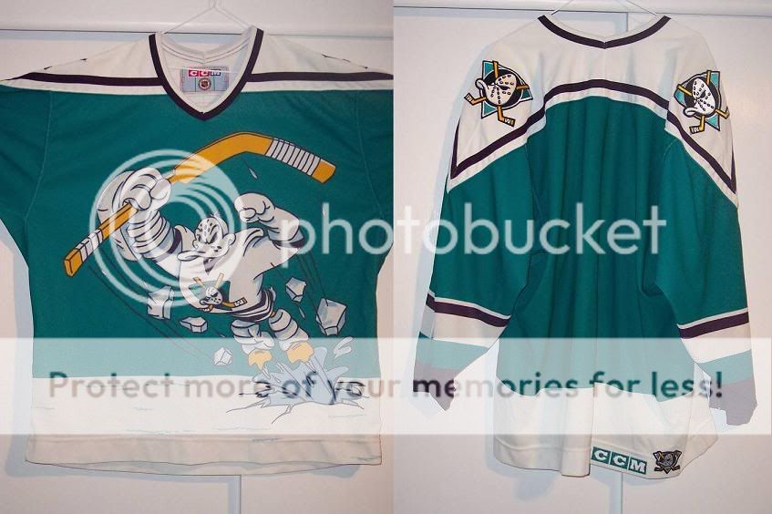
Anaheim Ducks – I remember when I first saw the jerseys in D2, back when the team was the Mighty Ducks. While I’m glad the team is just the Ducks now and have gotten rid of that terrible early nineties color combo of purple and teal, the current uni’s could use some work. The logo is still a bit cartoony and cheesy. However, at least Charlie Conway doesn’t have to take on the Hawks and Iceland wearing this anymore.
Atlanta Thrashers – I for a while was of the belief that the team name Thrashers was stupid. However, upon doing research I’ve learned that the Thrasher is the state bird of Georgia and was selected by the fans, so I guess that can stay. But the logo and the current jerseys got to go. The logo has too many colors for it to be effective, and it too falls into that clip arty category. The jerseys, with the word Atlanta going down one shoulder are terrible, and the person who designed them should be shot.
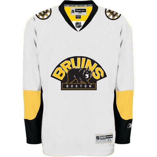
Boston Bruins – Any original six team automatically has a cool mascot to me. This team is a case study of why you only need two colors besides white. The simple color scheme and simple logo is all you need. Also, give the club kudos for the new alternate jerseys with the throwback logo.
Buffalo Sabres - I was glad to see they got rid of the black and red jerseys from the 90s. But the Sabres really need to go back to their old logo of the crossed swords with a buffalo in the middle. Simple, effective, with a unique color combination of blue and yellow made their old jersey a beauty. The current slug/Donald Trump’s hair logo is stupid. Also, get rid of the dumb pit stripes, and give me the jersey that Pat Lafontaine wore.
Calgary Flames – Flames is a solid name for a team, and the flaming C logo is effective as well. However, this is a classic example of black getting in the way of a perfectly fine uniform. The black pants and gloves make the club look like a house team, and the black trim is obnoxious. Go back to the red and yellow uni’s of Mike Vernon’s day (or at least give me an update). Also, maybe have some fun with the trim. Maybe have flame trim at the bottom of the jersey or on the socks.
Carolina Hurricanes – I really wish there weren’t so many weather related mascot’s in this league, but of the three I like the Hurricanes the best. The logo is really simple, and has only two colors. I could do without their current alternate jerseys. The triangle behind the logo is stupid, and the hockey stick flagpole looks dumb as well. I like where their heads at though with the hurricane flag idea for an alternate logo, but that is actually a gale flag. Tweak this a bit, put it on a red jersey, and it could work. The black jersey thing is a little played out at this point.
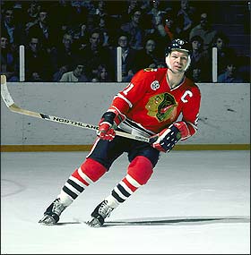
Chicago Blackhawks – Great mascot, great logo, great alternate logo, great jerseys, even cooler throwback jerseys, and as a Wings fan, it pains me to say this, but I think they have the best unis in the league.
Colorado Avalanche – To go from the Quebec Nordiques’s kickass unis to this ugly ass uniform was a disaster. They have maroon and blue with jerseys, maroon and blue and grey socks, but black gloves, pants, and helmets making them a victim of the house team effect and the too many colors effect. The logo is kind of clip arty as well, but at the same time I don’t have any better ideas for an avalanche logo. The trim on the jerseys really needs to be fixed up though. Maybe they could just start all over and name the team the Colorado Turtles.
Columbus Blue Jackets – I always assumed a blue jacket was a type of bumblebee, and never understood why their logo has all the stars on it. Evidently the Blue Jacket name comes from the Civil War soldiers from Ohio, which actually makes it a decent mascot if the logo reflected this. They need to make this part of the logo and embrace the civil war heritage (it would be nice to see a northern based Civil War mascot to combat the Rebels and Vols of the world). If that doesn’t work, just change the team name to the Buckeyes to fool Columbusians into showing up to the games.
Dallas Stars – Not a bad mascot, not bad colors, but it just could’ve been so much cooler. Remember, this team is descendant from one of the all time great team names in sports, the Minnesota North Stars. While I really think it was the height of stupidity for the NHL to move a team out of Minnesota, I will give Dallas its props for embracing its team and hockey as a sport. But how cool would it have been if they were the Dallas Lone Stars, not just the Stars?
Detroit Red Wings – Number two in the league for my money- a great simple logo with just two colors and a simple jersey design. This jersey just shows how less is more sometimes. All logo designers and jersey color picker outers need to pay attention to this jersey.
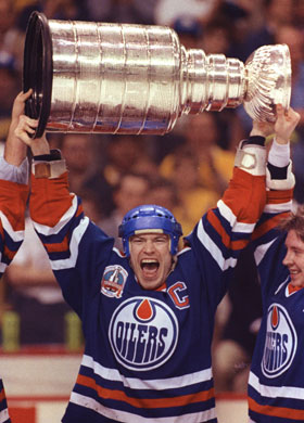
Edmonton Oilers – A good mascot that makes sense in the oil rich area of Edmonton. The logo has always been simple and effective to me, but I could do without the piping on their current jerseys. They changed from blue and orange to navy and burnt orange a few years back, but word on the street is that they’re wearing their old throwback unis for a few games. I think they should go back to these all the time because after all, if you won five cups in them, why change the unis?
Florida Panthers – A middle of the road mascot, and not a bad logo. The red, navy and gold color scheme is a bit busy however. Just black and white would look pretty badass if you ask me.
Los Angeles Kings – The LA Kings have a solid mascot with a solid color scheme. Purple is the color of royalty after all. The current crown logo isn’t bad, but I have to say I liked the coat of arms logo they just changed from a little bit better.
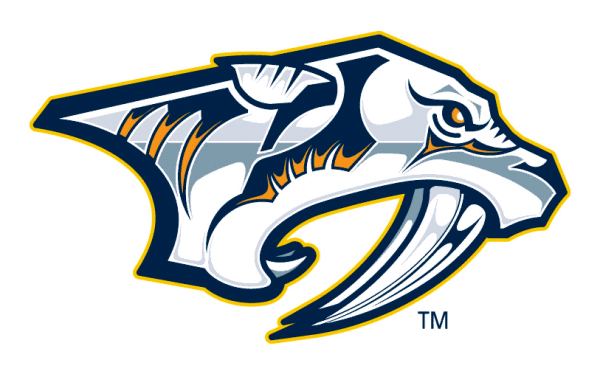
Minnesota Wild – This team name sort of prompted this column. What the fuck is a Wild? Evidently it’s some saber tooth tiger shaped thing with trees on it, which looks eerily similar to the Nashville logo. They should’ve gone with the Minnesota Fighting Saints as a tribute to the WHA team, or furthermore stuck it to Dallas for moving by calling the team the North Stars. Anything but the Wild- it sounds like an Arena Football League team. Once again, there are two many colors and too much crap going on in the logo. Get rid of the gold, change the logo, and change the team name. However, the Wild’s success (every single game sold out) despite their atrocious logo and sometimes lackluster play on the ice illustrates the need for the league to put teams in hockey cities, and further proves my theory from my last post.
Montreal Canadiens – Great team name, great logo, great sweater, no further discussion or links needed.
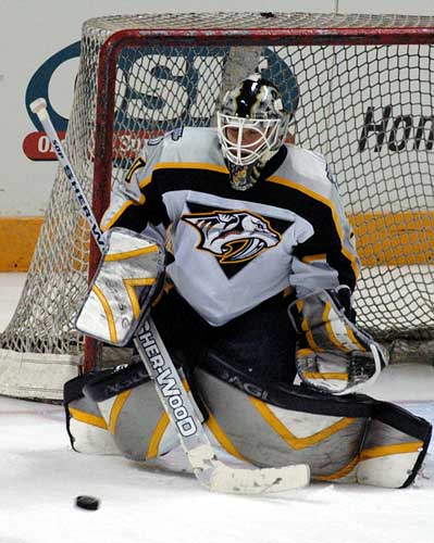
Nashville Predators – Predators isn’t a bad mascot, but it’s very generic. Once again I wish the league did a better job of embracing a city’s culture and was more creative with the team mascot. Nashville is known for its music, so the Nashville Musicians or something along those lines would’ve been pretty cool. The uniform is a bit busy for my tastes, and I won’t even bother providing a link to the deplorable alternate jersey.
New Jersey Devils – This club made a wise decision changing its colors from green and red to black and red. The Christmas decorations ensemble did not look very tough, and was kind of contradictory to naming the club the Devils. The logo is actually deceptively cool. The NJ with the stylized horns and tail is simple but nicely done.
NY Islanders – This is one of the cooler team names in the league. Jets, Mets, and Islanders fans are generally Long Island folks, so the team name and the logo really embraces the community. There was a brief period where the club fell victim to the teal craze of the nineties, but now their unis are for the most part back on track. Once again, the uniform is a little busy with the lines on the shoulders, but I can live with that. The Chevron patch on the shoulder representing the club's four Stanley Cups is really cool. In any event, I guess a solid uniform still does not prevent you from signing Alexei Yashin to a terrible contract.
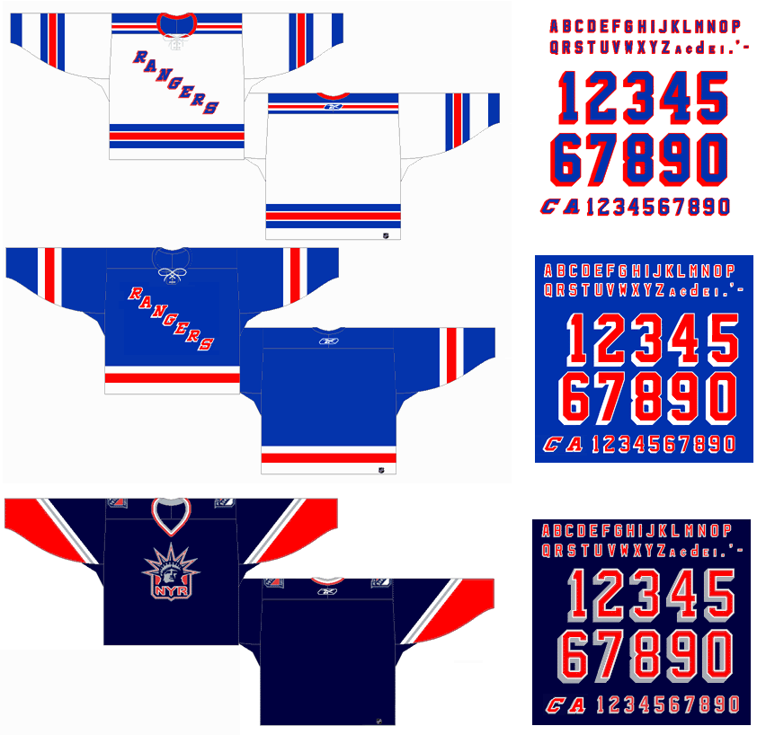
NY Rangers – Once again it’s an Original Six team, so of course the unis and the team name are cool. The classic Rangers script across the front of the sweater hasn’t been changed in years, and it doesn’t need to be. The alternate sweater has to go though. A marquis franchise with classic uniforms should not have to resort to selling alternate jerseys. Also, extra kudos for pulling off the collar laces so well.
Ottawa Senators – The league had the right idea for this club by reviving the Senators mascot from back in the day. The color scheme of red and black works well, and I liked the original logo as well. While technically speaking the logo is of a Centurion, not a Senator, it still fits and was a good logo. The new logo is a bit cartoony to me. Also, once again the pit stripes have got to go. A team with an old school crest and an old school history deserves a simple straightforward jersey. This old bumblebee sweater isn’t have bad either.
Philadelphia Flyers – The logo and the mascot are classics. They’re original and name rolls off the tongue because it features alliteration. I have one request- go back to the orange jerseys. The black jersey is very played out, and the orange was sharp and unique– very few clubs in any sport have orange jerseys. Plus you can’t see the black logo on the black background.
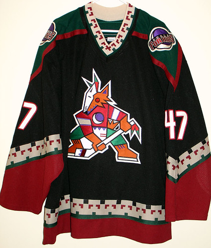
Phoenix Coyotes – While I do mind hockey in Phoenix, I do not mind the mascot or the team colors. The Coyotes wisely changed their color scheme from black, green, red, tan, and a bunch of other colors on the crest to a simple dark red and white. The logo is also much simpler and better. This may come as a surprise thought but I actually liked their old Native American style trim on the old sweater (just the trim though). I thought it was unique to the team and a cool tribute to the Native population in the area. This sweater also fell victim to the RBK edge uniform though by losing its bottom of the jersey trim. Fix that, and you got a really cool jersey, but I would rather this team move back to Winnipeg.
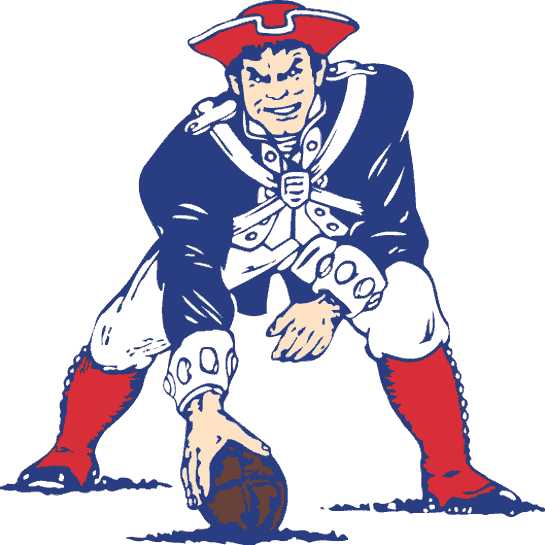
Pittsburgh Penguins – Pittsburgh has a cool thing going with all their clubs being black and gold in color scheme, in tribute to the City of Pittsburgh’s flag. This club did a terrible thing when they got rid of the skating penguin logo for the more streamlined flying penguin logo with the stripes. Just like how Pat the Patriot is cooler than the Flying Elvis logo that the Patriots use on their helmets now, the skating penguin was better and needed to come back. It’s back, but the Penguin’s gold isn’t the yellow gold it used to be. They should go back to those colors to match the Steelers and Pirates, and add some trim at the bottom of the jersey.
San Jose Sharks – You can thank this team for kicking off the teal craze of the nineties. I loved seeing my beloved Pistons where teal. Thanks.
St. Louis Blues – One of the coolest and most unique mascots in all of sports. This team and the former New Orleans Jazz are the only two big league clubs named after a type of music. With their current sweater, they have shades of navy and royal blue. Pick a shade of blue, and stick with it. Also, maybe use those alternate jerseys with the Gateway Arch on the crest full time.
Tampa Bay Lightning – The last of the weather related mascot clubs in the league. Not a terrible name, but not that good of one. It would have been really cool to me if they did some sort of cigar related theme with Tampa being nicknamed Cigar City, but I guess that wouldn’t fly in this day and age. The logo itself is a little clip arty again, and I could do without the lightning bolts on the pants, but I can live with it. What I’m really pumped for is the new alternate sweater, which is blue instead of black, and features a script bolts across the chest like the Rangers jerseys. Nicknames and abbreviations on jerseys are always cool to me, and I like this jersey a lot.
Toronto Maple Leafs – A great mascot that is unique to hockey, a simple two color scheme (or should I say colour scheme), and a simple jersey. Simply timeless and classic, and no links required.
Vancouver Canucks – Every league has one I guess, Oregon in NCAA football, the Houston Astros in MLB, and of course the Vancouver Canucks in hockey. They have gone through more ugly uniforms than any other team in the league, and still haven’t gotten it right. The notorious V stripes, the Star Wars/spaghetti bowl/flying skate logo, the atrocious orca logo, and now back to the hockey rink logo with the atrocious orca logo with a script Vancouver over the top. This club just doesn’t get it, but they should go back to the ugly V stripe sweaters. At least those were so bad they were good. You Google the Canucks unis on your own- I’m getting lazy and I don’t want to find twenty links to all of their god-awful jerseys. By far and away the worst unis in the league.
Washington – I always liked the pick of Capitals as the team mascot- a solid nod to the team’s hometown. For the new Rbk unis, they did a really nice update of their old sweaters. The pit stripes for whatever reason look good on this sweater, and the team was wise enough to add some trim at the bottom of the jersey, which really makes them look like game jerseys, not practice jerseys. I think on this particular entry I proved that I am not a complete curmudgeon when it comes to jerseys.
While it was fun for me to come up with all the links and bullshit about all the unis/team names in the league, at the end of the day this series of entries is about the business end of the NHL. Strong mascot choices and merchandise sales are good business, and the league has done a poor job of making these choices over the years. Some choices have been missed opportunities, and some have been flat out awful. However, this is also one of the easiest things the league can fix. My next article will cover the league’s exposure on TV and marketing, which will be critical to the league’s future success.
Subscribe to:
Post Comments (Atom)


Nicely done Pete, but I must say, regardless of your feelings on the Caps jerseys...you are a curmudgeon.
ReplyDeleteJust read this.. and it's great!
ReplyDeleteI am a "Columbusian" and what he said is funny/true anout support here at times.
("...change the name to Buckeyes...")
Well, until the last few weeks here... now it's crazy packed.
But yes, the heritage of the logo, is sort of lost on the whole "Blue Jackets" thing... hmph.
A great read though, my friend!
Just to address the Dallas Lone Star(s) issue ... believe me, there is no doubt that the club thought about that idea before realizing that pluralizing Lone would be a bit of a contradiction ... thats like pluralizing the Lone Ranger to the Lone Rangers ... that wouldnt exactly make any of them lone, would it? :)
ReplyDeletejust one more comment (cool article btw)
ReplyDeleteI'm sorry but the Quebec Nordiques uniforms were one of the ugliest thats ever been ... ugly is ugly no matter from what era.
On the other hand ... I couldnt agree with more though about the Calgary Flames intrusion of black ... this may sound a bit odd but their uniforms remind me of cheeseburgers for some reason ??
totally disagree with the caps jerseys, i think all dat piping looks like shit,and disagree with the abbreviations b/c tht right there is terrible marketing, not bad on the bolts though for some reason, thts the only team i like with tht style. I love the Sharks and teal but not how teal took over the pistons like you said, it was terrible. I'm a flyers fan and have always hated da blak unis thank god we went back to orange, the blacks barely worn now thankgod. nut i hate how rbk edge fucked up so many jerseys. Go back to the old stlyed sweaters!
ReplyDeletegood stuff, i agree with everything you said for the most part except, and its a big except, the vancouver unis are sickkkkk! agreeed in the past theyve had some of the worst uniforms in sports but i think the blue/green and the updated orca logo and the hockey stick alternate are all awesome, id say top 5 in the league for sure.
ReplyDeletePretty good on everything EXCEPT.. Vancouver has probably the nicest jersey in the league. especially the alternate with the stick. They're blue and green go together so well.
ReplyDelete